Announcement

Collapse
No announcement yet.

Marlins to Unveil 25th Anniversary Logo on Tuesday

Collapse
X
 
  • Filter
  • Time
  • Show
Clear All
new posts

  • Marlins to Unveil 25th Anniversary Logo on Tuesday

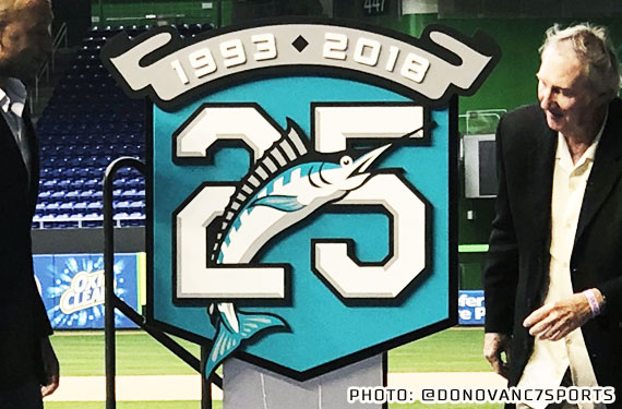
    Marlins to unveil 25th anniversary logo
    By Joe Frisaro MLB.com @JoeFrisaro
    Feb. 2nd, 2018
    MIAMI -- The Marlins will have a new look and a special commemorative logo when they take the field this season.

    The club on Friday announced a special presentation has been scheduled for Tuesday at Marlins Park, where the team will unveil its 25th anniversary logo. Marlins chief executive officer Derek Jeter and Charlie Hough, who started the first game in franchise history in 1993, will be on hand.

    The unveiling will be before current season-ticket members who have had an account since 1993. Additional details about the logo and the silver anniversary of the franchise also will be revealed at the event, which begins at 4 p.m. ET.

    As part of the event, Hough will participate in a Q&A session with Marlins raido voice Glenn Geffner and season-ticket holders.

    An expansion franchise, the club was the Florida Marlins from 1993-2011. Since '12, the team has been the Miami Marlins playing at Marlins Park.

    The team is under new ownership this season. In October, the group fronted by Bruce Sherman and Jeter purchased the club from Jeffrey Loria.

    The new logo unveiling will be followed by Spring Training, with pitchers and catchers workouts beginning on Feb. 14 at the Roger Dean Chevrolet Stadium complex in Jupiter, Fla.

    Joe Frisaro has covered the Marlins for MLB.com since 2002. Follow him on Twitter @JoeFrisaro and listen to his podcast.
    https://www.mlb.com/news/marlins-to-...go/c-265817532

    PLEASE announce Friday nights at home will be played in throwbacks.

  • #2
    Originally posted by Party View Post
    https://www.mlb.com/news/marlins-to-...go/c-265817532

    PLEASE announce Friday nights at home will be played in throwbacks.
    Yes please.

    Comment


    • #3
      Where can it be seen ? Online only or on Fox Sports Florida ? where ?

      Comment


      • #4
        It’s ugly.

        This off season is the gift that keeps on giving.

        Comment


        • #5
          It’s teal.
          Originally posted by Madman81
          Most of the people in the world being dumb is not a requirement for you to be among their ranks.
          Need help? Questions? Concerns? Want to chat? PM me!

          Comment


          • #6


            - - - - - - - - - -

            Will they be using this as a sleeve patch I'm guessing?

            Comment


            • #7
              I wonder if this means they’ll go back to the old logo with an “M” instead of the F?

              Comment


              • #8
                I couldnt care less regardless, but there is this strange market for the old school marlins logos and the teal colors, so this seems like a good move. I wonder if they are also testing the teal out for possible future changes to our normal logo or if this is just a 25th anniversary thing only.

                Comment


                • #9
                  Originally posted by fish16 View Post
                  I couldnt care less regardless, but there is this strange market for the old school marlins logos.

                  Agreed. I don’t get it.

                  But it’s becoming clearly evident to me that I’m in the minority of people who like the new Miami design much better.

                  Comment


                  • #10
                    Originally posted by Namaste View Post
                    Agreed. I don’t get it.

                    But it’s becoming clearly evident to me that I’m in the minority of people who like the new Miami design much better.
                    I think its just nostalgia but im cool with whatever they decide. Id be cool with 2 uniforms too, one similar to the new one and one incorporating the teal from the old days. If they do market research and decide to go back to teal with a more modern kick id be cool with whatever. I honestly dont care, whatever they do research and find the fans like more.

                    Comment


                    • #11
                      Originally posted by fish16 View Post
                      I think its just nostalgia but im cool with whatever they decide. Id be cool with 2 uniforms too, one similar to the new one and one incorporating the teal from the old days. If they do market research and decide to go back to teal with a more modern kick id be cool with whatever. I honestly dont care, whatever they do research and find the fans like more.
                      I think they both have a place - the original F logo has a more traditional look (which might appeal more to Jeter, as he came from the Yankees, who have barely changed in however many decades), whereas the current M logo definitely has a more modern/contemporary look to it. The current logo has certainly grown on me to where changing it would seem weird now. That said, I wouldn’t be surprised to see them revamp the logo to be a cross between the two.....maybe pulling the M from the current logo and combining it with a “modernized”/streamlined marlin encircling the M. The question is the colors. The 25 year logo certainly points to them at least considering reverting back to the black and teal (again, Jeter probably values tradition, especially when we’ve won both World Series in the old setup, and the Miami days have left a lot to be desired.

                      Comment


                      • #12
                        Without getting into the new logo being emblematic of the Loria ownership...

                        From the very beginning the wrong colors have been emphasized. We are in one of the most vibrant cities in the country, complete with a flourescent ballpark, and its baseball team wears a uniform that is dominated by black. This goes back to the 2003 rebrand, where we basically went to a black and silver team. Granted, in early 2000s uniform fashion teals and purples were out and black, silver, and navy were taking over sports. But teal has been a fairly fashionable color since 2012/3. The team definitely missed the boat on that. They could have easily married the MiLB Marlins and MLB Marlins and used orange and the aqua blue more heavily on the field-- but they didn't.

                        The most unique uniform in the entire set is relegated to Sundays at home. The orange hats disappeared after the second year. The most unique color in the palette, which is fairly similar to teal, is only an accent color. We were teased with blue tops and nothing ever came of it on the field.

                        The road uniform is almost non-existent.

                        The Rockwell number font has never worked well either.

                        The Marlin swish was a poor attempt at an abstract marlin. The bill and fin convey swift movement but the tail looks almost like an overweight slow after-thought.

                        Comment


                        • #13
                          I agree with Festa. The hat / primary logo has too much going on. It's HUGE on the hat, and is a mess. The M is sharp without the abstract fish. I think the cap would be fine if it dropped the fish and just had the M. I also think teal is an excellent accent color. The 2003 - 2011 primary home whites is a great example of how it can work exceptionally well as an accent.

                          Comment


                          • #14
                            Originally posted by Party View Post
                            Without getting into the new logo being emblematic of the Loria ownership...

                            From the very beginning the wrong colors have been emphasized. We are in one of the most vibrant cities in the country, complete with a flourescent ballpark, and its baseball team wears a uniform that is dominated by black. This goes back to the 2003 rebrand, where we basically went to a black and silver team. Granted, in early 2000s uniform fashion teals and purples were out and black, silver, and navy were taking over sports. But teal has been a fairly fashionable color since 2012/3. The team definitely missed the boat on that. They could have easily married the MiLB Marlins and MLB Marlins and used orange and the aqua blue more heavily on the field-- but they didn't.

                            The most unique uniform in the entire set is relegated to Sundays at home. The orange hats disappeared after the second year. The most unique color in the palette, which is fairly similar to teal, is only an accent color. We were teased with blue tops and nothing ever came of it on the field.

                            The road uniform is almost non-existent.

                            The Rockwell number font has never worked well either.

                            The Marlin swish was a poor attempt at an abstract marlin. The bill and fin convey swift movement but the tail looks almost like an overweight slow after-thought.
                            I love the blue uniform tops that they sell only at the stadium - I bought one (and have Stanton's number/name on the back....should've left it blank) and love it.....and I pair it with the orange hat.

                            I started to work on a modern/abstract version of the original swoosh marlin last night, but my computer was acting up so I didn't get to work on it much. I'll post it when I get a chance to do it.

                            Comment

                            Working...
                            X