Announcement

Collapse
No announcement yet.

New Hideous BP Uniforms for 2014

Collapse
X
 
  • Filter
  • Time
  • Show
Clear All
new posts

  • New Hideous BP Uniforms for 2014

    As usual MLB is changing BP uniforms (every 3 years) and, as usual, we've found a way to be the ugliest.
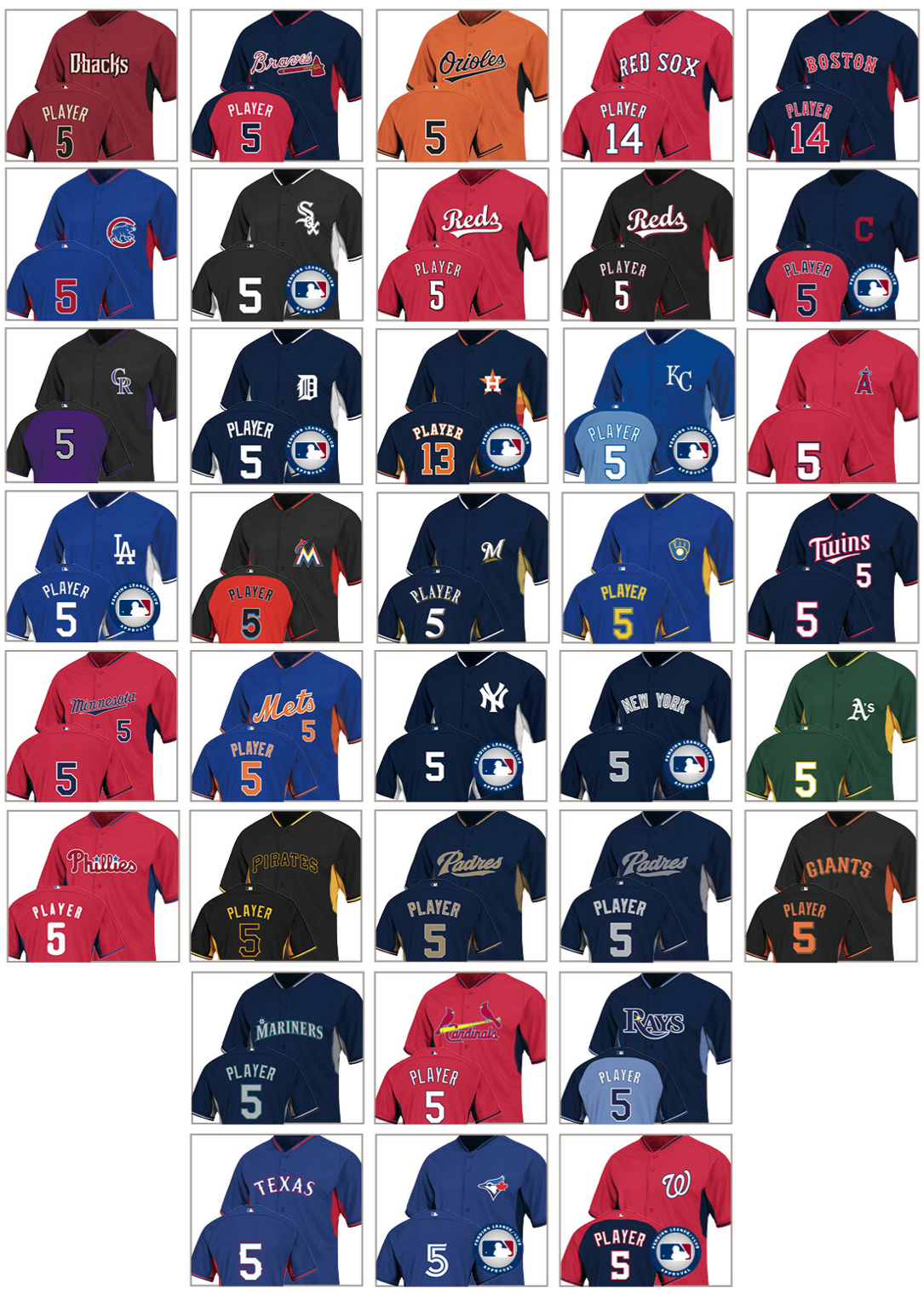


    That's right...the front is black and the back is orange. We're not the only one but some others like the Rays and Royals work pretty well. Rockies is pretty bad too and Indians aren't the best either.

    Love the Astros one but I love the whole uniform set so no surprise there. In case you're too lazy to blow this picture up, its side panels have the "tequila sunrise" pattern from the 70s/80s.

    Source: http://espn.go.com/blog/sweetspot/po...014-bp-jerseys
    Last edited by emkayseven; 10-03-2013, 08:04 AM.
    Originally posted by Madman81
    Most of the people in the world being dumb is not a requirement for you to be among their ranks.
    Need help? Questions? Concerns? Want to chat? PM me!

  • #2
    that Pirates one is awful

    Comment


    • #3
      Our BP jersey's are not that bad...

      Comment


      • #4
        I like the Brewers one.

        Comment


        • #5
          I'm not sure how they determined which teams get contrast backs and which ones don't.
          This post was brought to you by: Dat SEC Speed

          Comment


          • #6
            Originally posted by Fritz View Post
            I'm not sure how they determined which teams get contrast backs and which ones don't.
            I've been trying to figure out why some teams have the logo on the front, while others get the team script (be it city name or team name) instead of the logo. Why not be consistent with them all?

            Comment


            • #7
              Awful. Looks like a flea market jersey.

              Comment


              • #8
                Originally posted by marlinsfan24 View Post
                Our BP jersey's are not that bad...
                You are right. The uniforms, logo, and colors in general are beyond awful. The BP jerseys are just part of that.
                Amy Adams, AKA Cinnamon Muff
                Logan Morrison: "If baseball didn't exist, I would probably be ... like a curler. Or a hairstylist."
                Noah Perio
                Jupiter
                39 AB
                15 H
                0 2B
                0 3B
                0 HR
                0 BB
                .385/.385/.385

                Comment


                • #9
                  Todd only wears camo cargo shorts.
                  poop

                  Comment


                  • #10

                    Comment


                    • #11
                      Not saying this facetiously at all but Miami Marlin clothing is pretty popular in the gay community...

                      Comment


                      • #12
                        Originally posted by The_Godfather View Post
                        Not saying this facetiously at all but Miami Marlin clothing is pretty popular in the gay community...
                        link?
                        Originally posted by Madman81
                        Most of the people in the world being dumb is not a requirement for you to be among their ranks.
                        Need help? Questions? Concerns? Want to chat? PM me!

                        Comment


                        • #13
                          Padres uni with the gold letter looks nice.

                          Our logo is disgusting. Should've kept the teal and silver.

                          Comment


                          • #14
                            Bunch of Orange-Backs, took our jobs.
                            There's No jOOj In Team.

                            Comment

                            Working...
                            X