Announcement
Collapse
No announcement yet.
New Animation of Ballpark on Marlins.com
Collapse
X
-
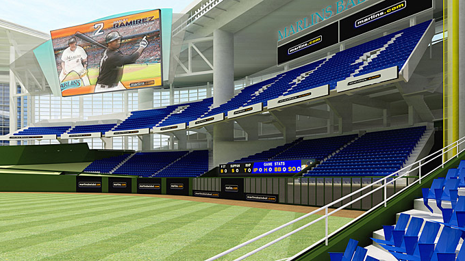
Actually, believe it or not, I'm happy they're going with teal seats - other renderings showed this dark royal/navy blue mix for the seats that looked like just about every other club's blue (Yankees, Rays, etc.). This represents that they're sticking with the distinctive teal. I know not everyone likes it, nor am I saying they should go back to teal uniforms, but still I think it's nice to have a different color from everybody else.
Also, another interesting thing I noticed! Look very closely at the home run feature at around 1:37 into the video, what do you see? No ugly "art" feature, but rather a jumping marlin as I always wanted and thought should be there. Given that this video is brand new (at least to us), could it be that the home run feature has been changed??Last edited by rmc523; 05-21-2010, 10:56 AM.
Comment
-
We can hope can't we?!? LOLOriginally posted by Festa View PostMore likely that this is an older animation that was released yesterday. That would explain why the seats are teal, the pond is still there and the OofT scoreboard in rightfield versus center.
-----
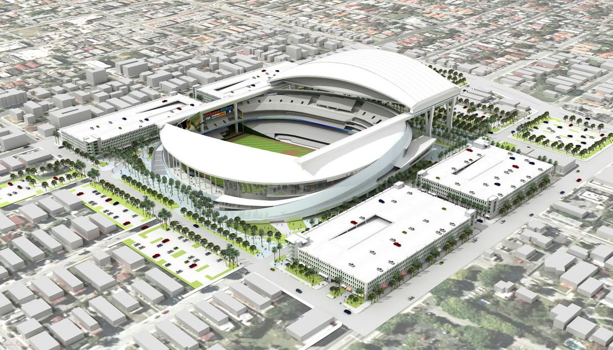
One thing to also note is that the stadium design for the upper deck (thus far on the 1st baseline) has changed since ALL of the renderings and animations were done, including this one. Look at these original renderings in the upper deck to the left of the press box/suites area, you'll see it features a separate seating area tha almost mirrors the 3rd baseline upper deck.

Compare that to today's webcam images, where you'll see it's one "solid" row of stands all the way across:

Comment
-
The upper deck on the first base side has been solid for awhile. The overhang in right has been modified as well.

Overhang:


The blue seat renderings are the most current.
http://www.soflamarlins.com/showthread.php?t=458
Comment
-
Oops, you know I had that other rendering here on the computer and never realized it featured the changed upper deck.Originally posted by Festa View PostThe upper deck on the first base side has been solid for awhile. The overhang in right has been modified as well.

The blue seat renderings are the most current.
http://www.soflamarlins.com/showthread.php?t=458
As for the blue seats, that to me represents a guaranteed change in team colors - I mean why would they make the seats dark blue if nothing Marlins-related uses that color? I'll be disappointed if/when that color change happens because I like the teal and how it's different from everyone else as I said above.
Comment


Comment