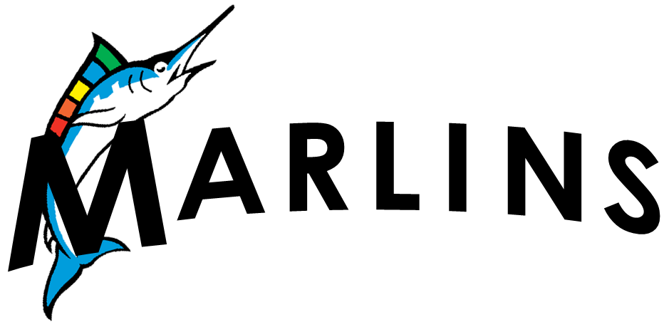
I'm a fan. Any attempt to make it look old school or more ornate would come off, to me, as artificial. Miami's not that type of city. We need clean and modern just make sure it's properly executed. Faux nostalgia is not for me.
Announcement
Collapse
No announcement yet.
New Uniforms Discussion: New Uniforms Seen FIRST on SoFlaMarlins.com
Collapse
X
-
Something about the font is 1950s-style modern to me. It's not bad, but it's not great either. I'll be happy they don't go for full-on faux 1920s old timey nostalgia nonsense like Harry alluded to.This post was brought to you by: Dat SEC Speed
Comment
-
It's called Futura and it was designed in 1927 so you are on the right track.Originally posted by Fritz View PostSomething about the font is 1950s-style modern to me. It's not bad, but it's not great either. I'll be happy they don't go for full-on faux 1920s old timey nostalgia nonsense like Harry alluded to.
Arch that in orange font with the light blue outline on a white jersey with no pinstripes and I'm a fan.
Comment
-
We already talked about this, but I just realized the ballpark logo is a Marlin. I find that to be very neat.Originally posted by Claudio Vernight View Post
This font will be on the wordmark for the jersey.
I am a fan of Futura as a font. I've worked with it a lot; it's very Miami to me - in a good way.poop
Comment
-
Someone on the Creamer board came up with this:

The wordmark wouldnt happen to be that, but arched, with the M having a rainbow colored (like the ballpark logo) Marlin jumping behind it (like it currently jumps behind the F), with the main color of the uniform set being a bright orange, now would it?Others have speculated that maybe all the jerseys say MIAMI.That description is a lot closer than people think. Much of it is true. Stop focusing so much on the team name, though -- the new identity is much more centered on the location.
Comment


Comment