
 Tweet
Tweet
What are the odds that the color scheme changes in a year or two if this really is hideous and the fans don't buy anything?
-
-
the fans will buy thingsComment
-
its trueComment
-
Ramp is right, if people are willing to buy apparel from teams like the old Devil Rays, they will buy just about anything. Also, even teams that have beautiful classic looks like the Yankees still sell ridiculous apparel in really awful colors because fans are dumb and like dressing like clowns.Comment
-
Especially because this is Miami. Nothing is too garish for us.poopComment
-
Teal has been gone for a while Sandro.Comment
-
There hasn't been teal in the uniforms for some time Sandro, don't you listen to David Samson?Comment
-
This thread lost all cred with "the gays" There's No jOOj In Team.
Comment
-
Samson was spotted exiting this vehicle earlier in the week......

--------------------
Also...the Marlins will be required to travel with Britto sponsered luggage.
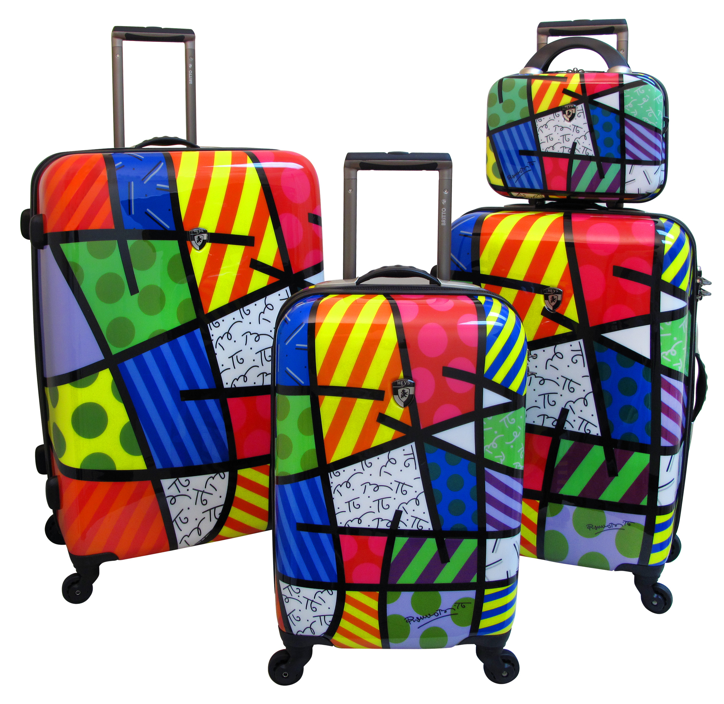
Comment
-
-
girl I know posted this on facebook today:

new logo?Need help? Questions? Concerns? Want to chat? PM me!Originally posted by Madman81Comment
-
The gays are gonna love it.Comment
-
http://espn.go.com/blog/sweetspot/print?id=14629
Friday, August 5, 2011
Get uniforms right and be who you are
By Steve Berthiaume
The Yankees feature one of baseball's timeless uniforms.
Bill Parcells once said, "You are what you are," meaning that if your football team's record is 8-8, whatever circumstances you'd dealt with didn't really mean anything; in the end you were a .500 team. It sounds depressingly pessimistic but the attitude is actually something out of a Zen koan; it strips away attachment and perception and zooms in on the core of what you are. That's more of a performance issue but it gets us pointed in the general direction of baseball uniforms.
For that topic, I prefer this: Be who you are. This speaks more about identity in regard to baseball franchises; more specifically the marketing and branding of each team's personality. Be who you are. By that I mean more than just a discussion of which uniforms you like best. This runs a bit deeper. Because fans, more often that not in my experience, have strong connections to a team's particular logo or color choice, the uniforms those teams wear represent a traditional identity, the inner layer of the core.
Too many franchises have become lost in the marketing jungle. In an effort to be current or edgy some teams are sporting homogenized, corporate colors and logos that seem to deny their histories and traditions. A few might have had logos that were at one point considered hokey or outdated. I say, embrace the hokey. Wear it with pride. All thirty teams have colors and logos that represent their one genuine identity with which fans connect. There is a reason why I see so many fans walking around wearing old hats with former logos. There is a reason those who market the game seem to try and manufacture nostalgia at every turn. It's because we've lost some of it in a haze of generic logos or poorly conceived alternate jerseys which only seem to admit that a much larger mistake was made in the first place. Be who you are.
Here's a list, a subjective one to be sure, of those who embrace their true identities and carry on tradition by wearing them proudly and those who have lost their way and hopefully will soon hear their true selves calling from an overlooked closet in a back room somewhere.
THE TRADITIONALISTS: Yankees, Red Sox, Tigers, Royals, Phillies, Braves, Cardinals, Cubs, Giants, Rockies and Dodgers.
This group is the creme de la creme; the ultimate in uniform and logo identity. Their franchise logos are simple and timeless. Their uniforms are professional, classy, almost elegant. One can imagine that their current caps, uniforms and logos will stay as they are for another hundred years. From older ones like the Yankees and Tigers to newer editions like the Royals and Rockies, this group has found who they are, and their logos and colors are part of that identity.
THOSE ON THE CUSP: Rays, Orioles, Indians, White Sox, Twins, Angels, Rangers, A's, Mariners, Marlins, Nationals, Pirates, Reds and Diamondbacks.
This group is close with only small details still to be ironed out. Have you noticed Matt Wieters' Orioles catching helmet? It's got the old white front cap that reminds one of the O's World Series teams of 1979 and 1983. It's intended to. Same for Joe Mauer's Twins catching helmet. Minnesota's move back to the classic TC caps and the brilliantly huge "Minnie and Paul" shaking hands logo at Target Field is a perfect example of what this post is intended to be about. That logo, maybe it's hokey and a bit 1960s-ish, but it's who the Twins are and that makes it great. It would be nice if the Angels would follow suit and go back to their former blue and red look with the lower case a logo, circa the Brian Downing and Bob Boone teams of the mid-1980s, a look they've revisited a few times this season. The Nationals resurrected the Senators old "Curly W" logo and colors and furthered that identity this year. For better or worse that logo is baseball in Washington. Be who you are.
The Indians, Rangers, Pirates and Reds are all just about where they should be, although despite years of hanging on in Cleveland the Indians' Chief Wahoo logo is still objectionable. The A's and Marlins have found a way to make interesting color choices work for them while the Rays did a wonderful job of tossing out ugly colors and logos and have remade themselves virtually in their infancy. The same can be said of the Mariners and Diamondbacks who likely just need a few more years to establish their true selves after questionable starts. The White Sox could probably be included in "The Traditionalists" group, but in some far off place it feels like they should go back to the red-and-white look worn by Dick Allen and Bill Melton in the early '70s.
THE OFFENDERS: Mets, Blue Jays, Brewers, Astros and Padres.
The Mets are one step away from jumping up to "The Traditionalists" group: all that's left is for them to do away with those awful black jerseys and hats. The Mets have a classic logo and a beautiful clean, blue pinstripe look that would be among the best in the game -- if they'd stop polluting it.
The Blue Jays. Everyone on the team should be dressed like Ernie Whitt or Garth Iorg. Toronto won two World Series with its old Blue Jay bird logo and the light blue and white colors with the split lettering. Be who you are. Their current look is awful. Joe Carter jumped around the bases in a unique and classic look that needs to be brought back. When I look at Jose Bautista wearing number 19 at the Rogers Centre I should see Otto Velez at Exhibition Stadium.
The Brewers' current logo is the absolute worst example we have of a generic, watered-down marketing mistake. The old Barrelman logo that used to be on the side of County Stadium was a classic. The ball in the glove logo of the 1982 AL pennant-winning team speaks even more to the point: that is who the Brewers are. My key point here is that this is not about living in the past or simply yearning for nostalgia. Those logos and looks were the Brewers' real identity, what made them special. I see those logos on hats and tee shirts in the stands every time I watch the Brewers. Their current uniforms and logo might as well say ACME on them. The Twins went from a sterile, indoor field with a weird modern logo to a sparkling new outdoor stadium with their former and true logo placed high above center field as a proud badge of honor. The Brewers have done the complete opposite.
There is nothing wrong with the Astros' current look, it just falls under the corporate homogenization heading. Either go back to the classic Jose Cruz crazy horizontal stripes or -- if that's just too much for your eyes -- then the Rusty Staub/Jimmy Wynn look with the lettering across the chest over the comet, either one. That's who the Astros truly are. Regardless, they should always have orange hats with the star and the classic H logo. Attention incoming ownership: Be who you are.
The same thing goes for the Padres. The Padres are lost. Baseball in San Diego is supposed to be colored brown and gold. Nate Colbert and Dave Winfield wore brown and gold. There were several versions of this look over the years -- pick one. In 1971, Enzo Hernandez had only 12 RBIs in 618 plate appearances while wearing brown and gold. In 1984, Steve Garvey and Kurt Bevacqua rounded the bases with arms raised after big postseason home runs wearing brown and gold. The Padres should never be blue. For better or worse, the Padres and baseball in San Diego should be colored brown and gold. Be who you are.
Follow Steve Berthiaume on Twitter @SBerthiaumeESPNComment
-
Agreed * sideways eight- DaftGod would be expecting a first pitch breaking ball in the dirt because humans love to disappoint him.Comment
-
Same.
Milwaukee needs to wear the old schools all the time.This post was brought to you by: Dat SEC SpeedComment

Comment